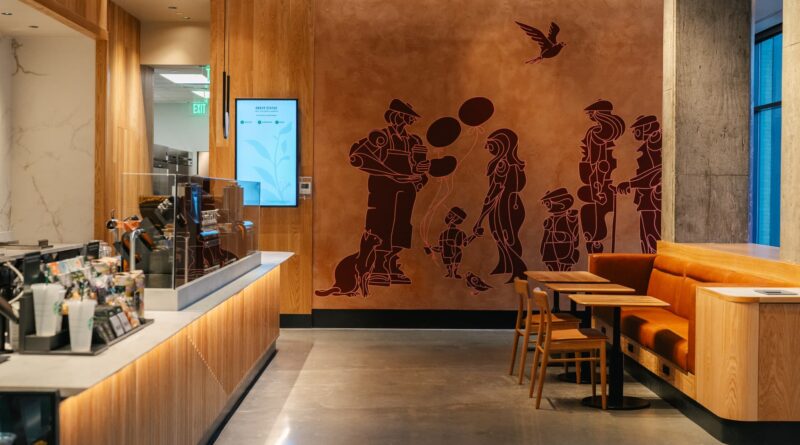
Starbucks has a new accessible store design. Take a look inside
[ad_1]
The exterior of Starbucks’ new Union Market location
Source: Starbucks
Starbucks has unveiled a new store design focused on accessibility and inclusion, with fresh light fixtures and open floor plans.
The coffee giant opened the first location with the new design on Friday in Washington, D.C.’s Union Market.
“Designing for disabilities is just good design for everybody,” said Sara Trilling, president of Starbucks North America.
She added that designing a more accessible cafe took about two years and that the company solicited input from Starbucks baristas.
Starbucks designed the store to have an unobstructed path for customers.
Source: Starbucks
The Union Market cafe has power-operated doors so customers can use less effort to enter the cafe. Once inside, they can place their orders with baristas using a new point-of-sale system that has an adjustable angle stand, voice assist, screen magnification and photos of menu items.
“Imagine somebody who doesn’t speak English as a first language, and you’re trying to make sure that you’re getting [the order] right and providing great service. You’ll have an opportunity through some visual cues to make those confirmations,” Trilling said.
The counters are also lower, making them more accessible for wheelchair users, for example.
The store’s counters are lower, giving wheelchair users a better experience.
Source: Starbucks
Behind the counter, Starbucks’ new Clover Vertica system for brewing drip coffee has a more accessible design, with a large dial and protruding buttons.
“You can actually feel the settings by touch or using light to indicate when brewing cycles and other things have been completed,” Trilling said.
Starbucks’ new Clover Vertica brewing system features large dials and protruding buttons for easier use.
Source: Starbucks
Digital status boards show customers when their drinks are ready to pick up, in addition to baristas calling out their names.
Starbucks also changed the store lighting to minimize glare, shadows and backlighting that can make it more difficult to see. Insulation has been improved, too, so stores aren’t as noisy.
And Starbucks designed the overall floor plan of the store to be free of obstacles and to have open sightlines.
All future company-owned locations will follow a similar framework. Starbucks plans to open more than 600 new stores this year, increasing its U.S. footprint by 4%, including licensed locations.
The store’s lighting is softer, and insulation keeps noise levels lower.
Source: Starbucks
Building more accessible stores won’t be materially more expensive than using current designs, according to Trilling.
“I think about it as something that’s going to help us in terms of customer connection. It’s going to help us in terms of employee engagement,” she said.
[ad_2]


